Brand
This design system relies on the Lualtek's design language and principles and it helps designers and developers to keep brand consistency across projects and design assets. There are many resources shared across the teams like company logos, assets and icons. Here you can find everything related to the Lualtek brand.
Anatomy
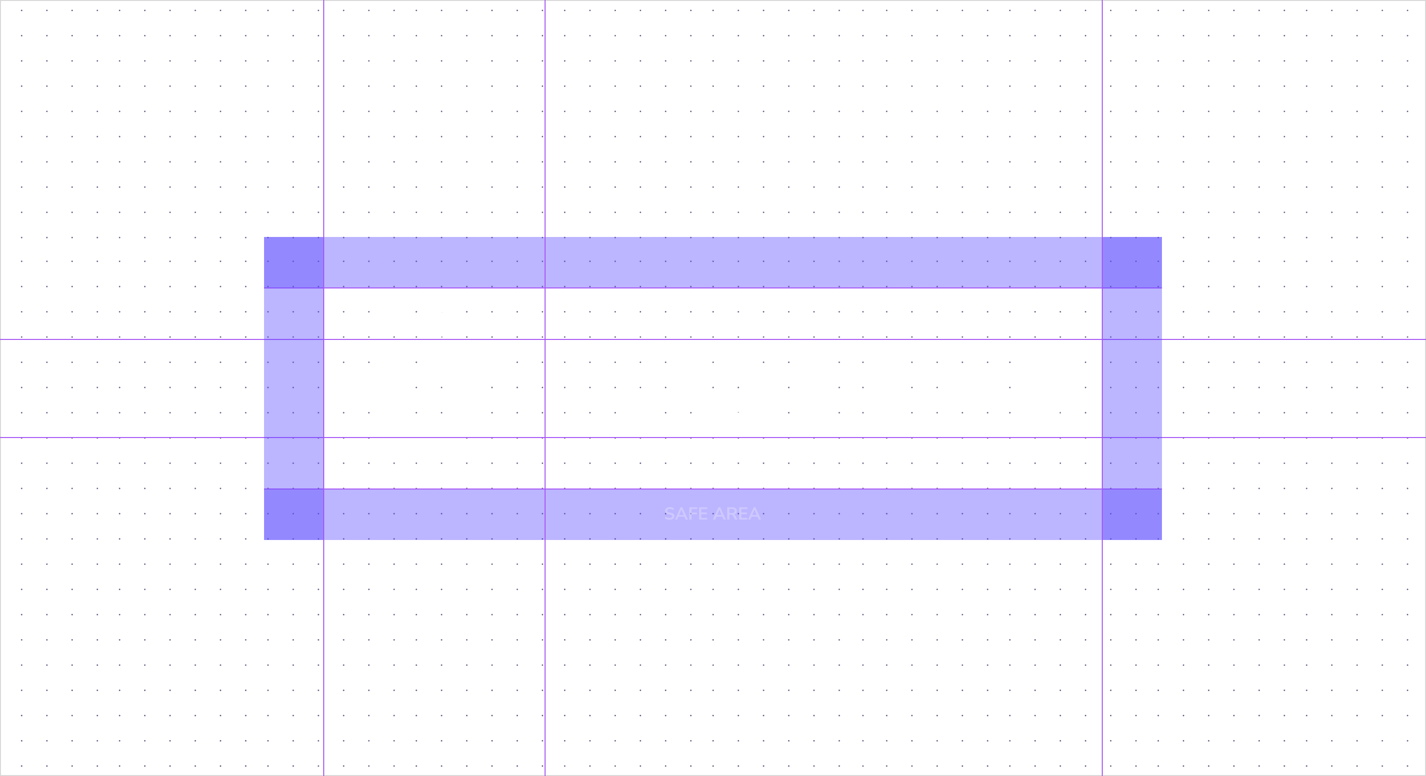
Optical kerning, refined weight and defined clear space, as well as delineated placement in relation to other content help to make it as instantly recognizable as possible at all sizes and in all contexts.
Logo formats
At Lualtek we use three different version of the company logo based on the situation.
Full
The full logo is used when the brand communication is strong and prominent. It needs a big white space area around in order to keep the information readable.

Wordmark
The wordmark only logo is used when the brand communication is strong and prominent. This is also the most common version of the logo used in the company.

Mark
The mark logo is often used when the brand identity should not be so prominent and when there is not enought room for other variants.

Colors
Lualtek's logo i always used as white or black color based on the context and background color. It is not allowed to use any other color for the logo.
Use Lualtek's brand color (brand-60) for call to actions elements like buttons, links and other interactive elements, or for backgrounds. Here some valid examples:
