Typography
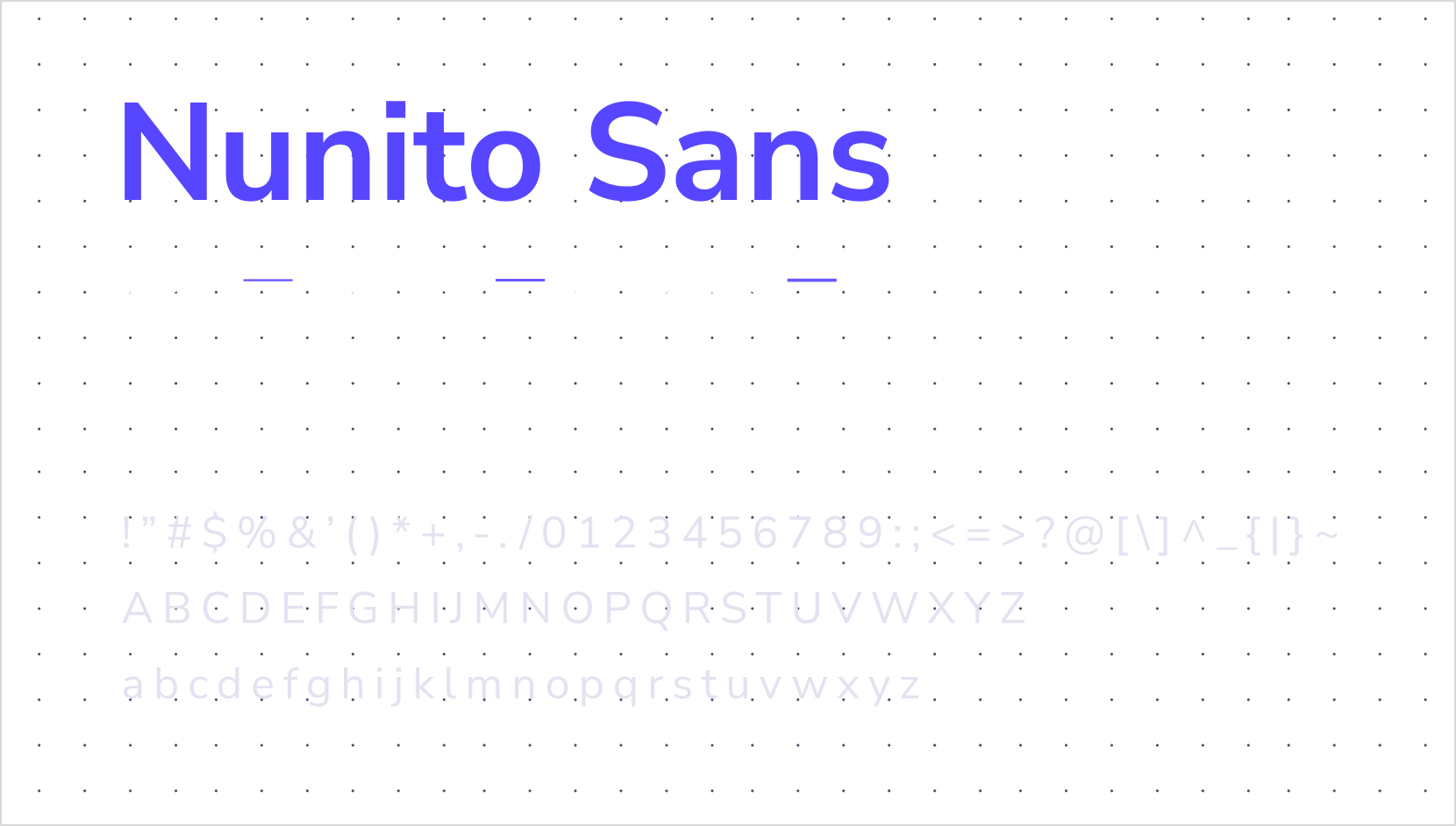
Lualtek's design system relies on a custom fonts called Nunito Sans. It is a sans-serif typeface that is available in many weights.
Typefaces
Nunito Sans (opens in a new tab) font grants an immersive experience with our digital products, providing a clear and legible reading experience along with a modern and friendly look.
Styles
To improve loading and rendering performance we picked only 4 weight. They are available as design token to be used in our products:
- Bold style
- Semibold style
- Regular style
- Light style
Type scale
In general, text elements and typography play a very important role, and represent one of the main ways of conveying information from one point to another. For this reason, typographic aspects should never be underestimated, no matter which is context. In Lualtek's design system, we have tried to balance the impact of text components with other interface elements.
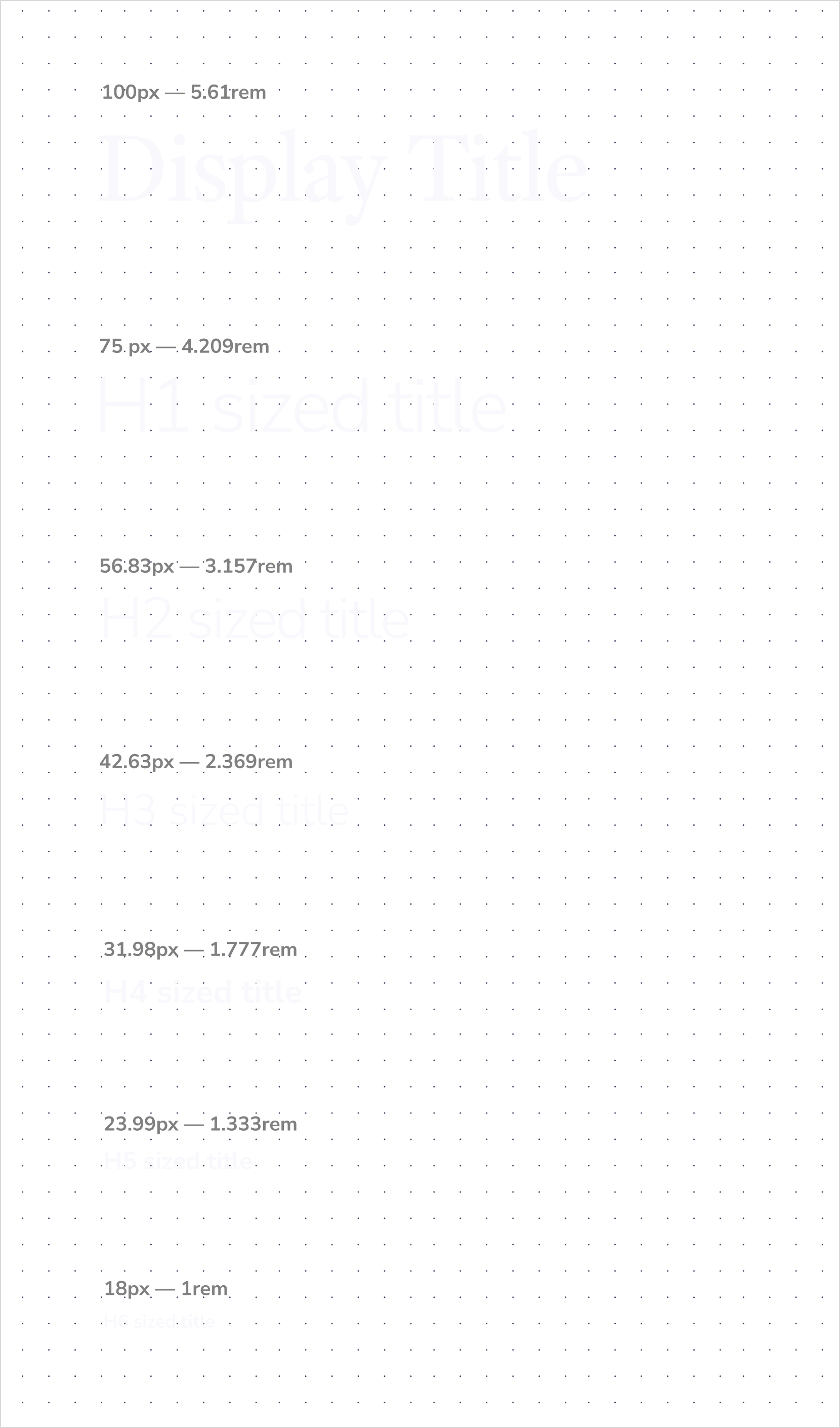
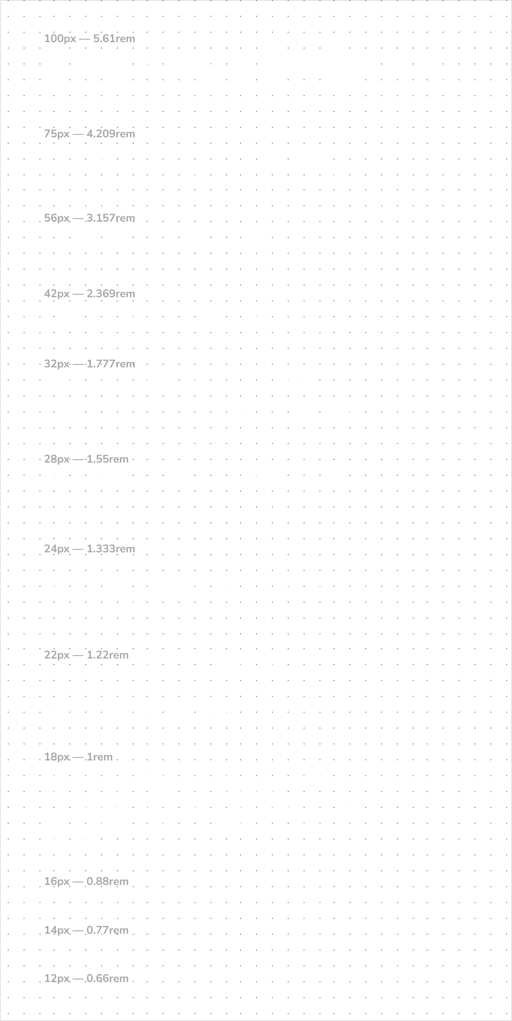
The type scale is a combination of 12 sizes that are supported by the type system. It contains re-usable categories of text, with an intended application and meaning for each.
Headings
Headings follow a scale based on a 1.333 factor (Perfect Fourth (opens in a new tab)) starting from the basic unit of 18px (1rem, 1em, 112.5%).
Content
Lualtek's typography system provides many different sizes for text content. While we suggest using text sized at least 16px for accessibility concerns, sometimes you have to use a smaller text, but you should avoid such situations as much as possible.
Responsive typography
The whole typography system of Lualtek UI is built on top of a responsive typography size which improve the readability and adapt the text size on smaller devices.
On smaller screens both titles and text content are dynamically resized, by default, to the previous step of the scale. This means that on smaller screens, the text size will be reduced by one step, going to the previous size available in the type scale. This behaviour can be disable by using the responsive prop on our Title and Text components.